Which Crop Worked Best? Your Responses
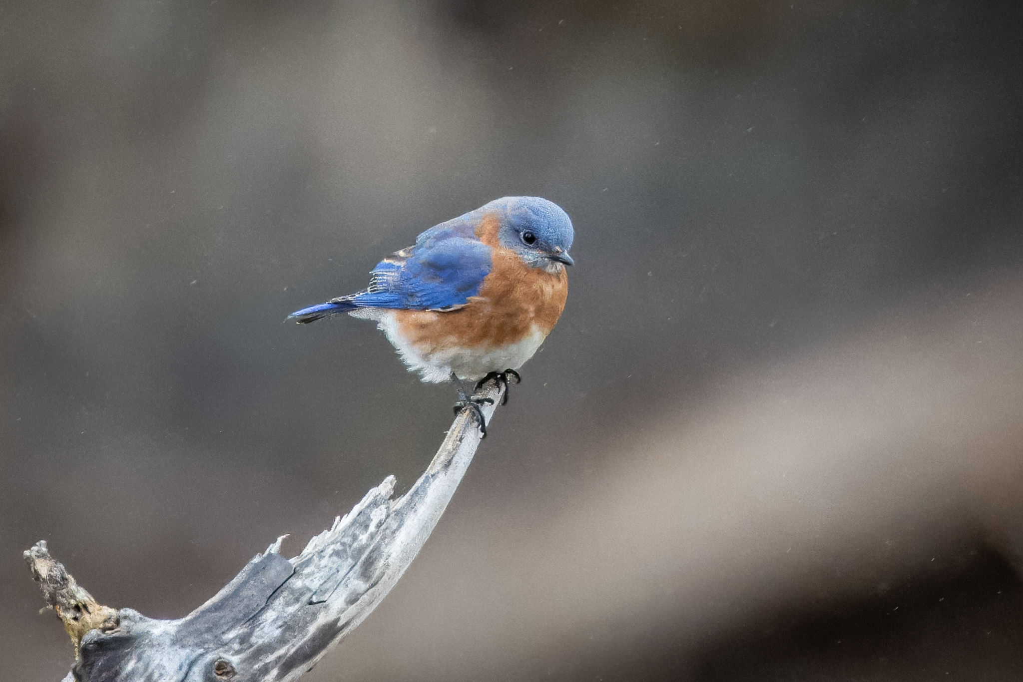
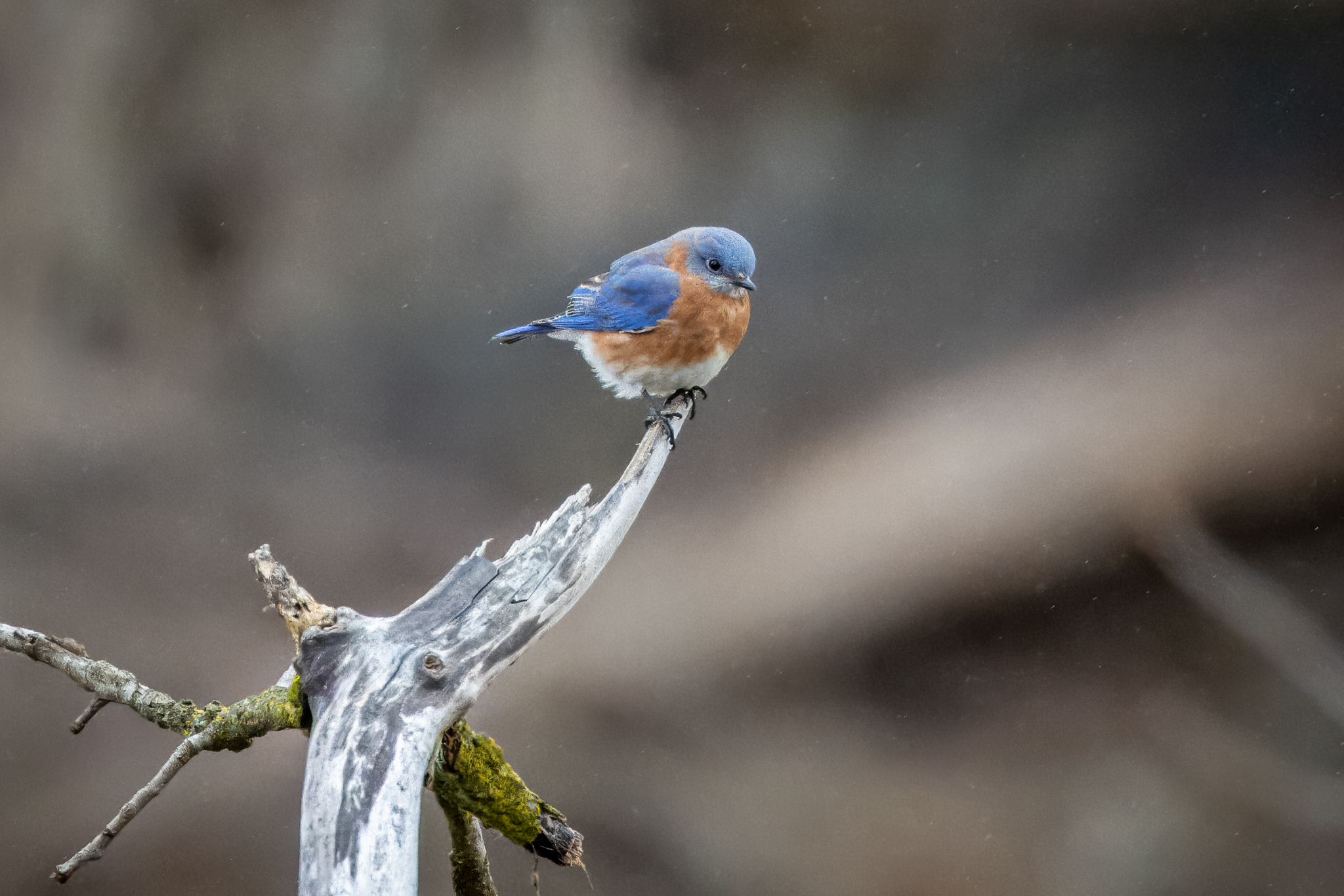
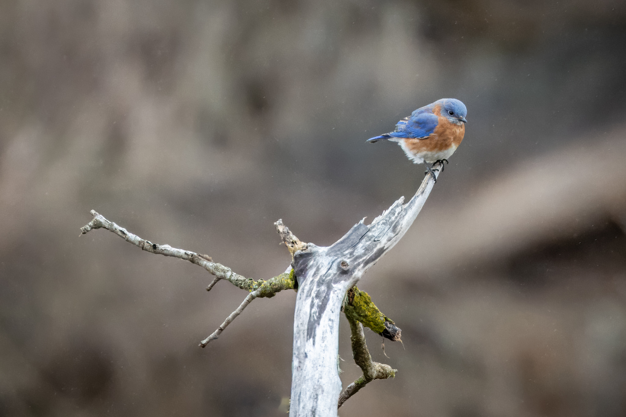
On Tuesday I posted three versions of the same shot because I couldn’t find a crop that I was happy with so I asked you to weigh in. Below are three variations of the same picture, each cropped a bit differently.
1 Bird Centered with limited view of the snag.
2. Bird centered with more of the snag shown.
3. Bird set to right, balanced by branch to the left of the snag.
Wow! We had a high degree of agreement that Crop #1 was the best of the three. Eighty-five percent of the responses said that #1 looked best, primarily due to the size of the bird. They said that due to the small size of the bird, it gets lost in the frame in Crops #2 and 3. TravelingOn said it best, “I often apply the rule of thirds and #1 makes the most sense, from that standpoint. The bird is the main subject and the branch and snag lead your eye into, and across the image as opposed to out of the image.”
The lesson learned here is that the main idea in bird photography is the bird, and if the bird isn’t the primary subject of the shot then it loses its impact.
If you enjoy seeing beautiful pictures of birds from around the world and reading about them Click Here to sign up for our mailing list. Members can post their own GreatBirdPics and learn more about bird photography techniques.


