It’s About Space
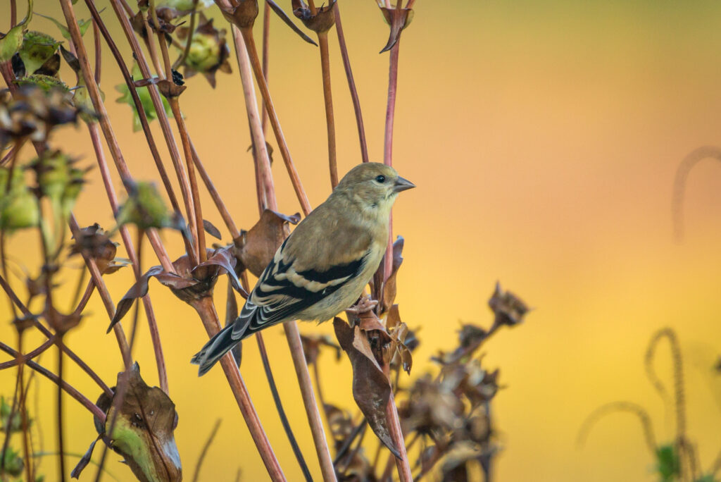
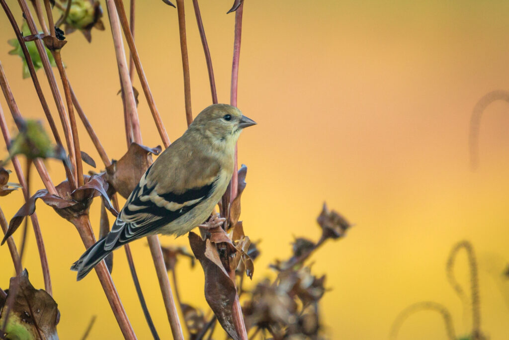
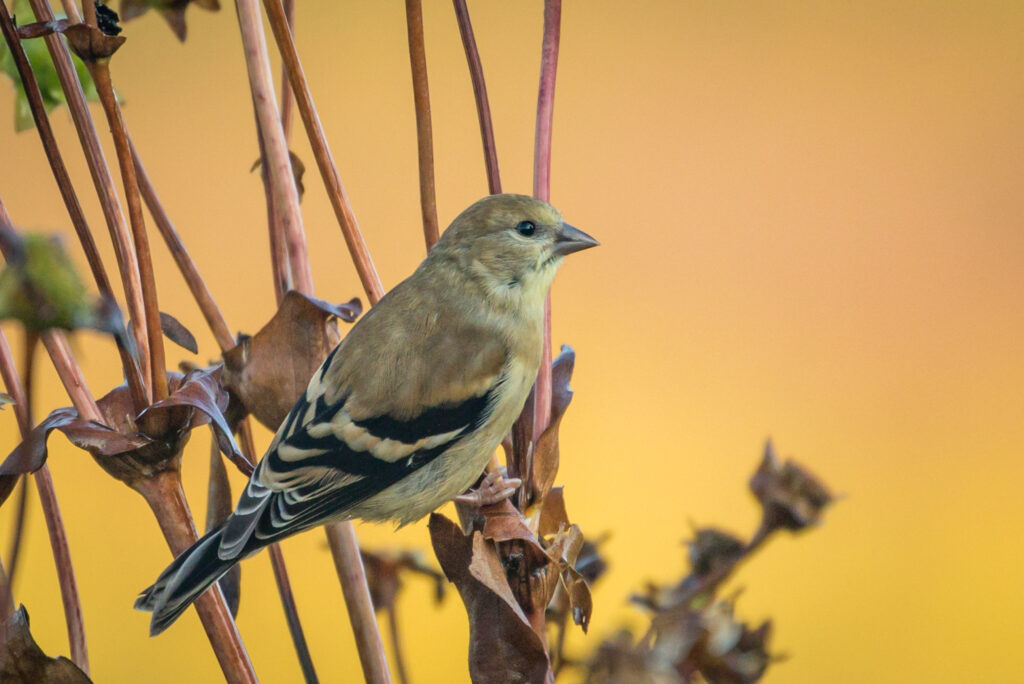
One of the things I think about a lot when cropping my pictures is how much space to leave around the bird. Too much space and the bird may get lost in the image. A close crop fills the screen with the bird, leaving little else of the surroundings to see.
I was walking through the Morton Arboretum the other day and spotted a Goldfinch perched on some grass. I was struck by the bright background behind it so I snapped a pic. When I got home I played with the crop to see which one I like best. Here are three versions of the same picture. Which one do you like best?
First
Second
Third
They are all the same picture but the crop shows more or less of the background. The size of the bird varies, too. It’s a subtle difference – does it make a difference to you? Reply to this email (or make a comment on the post) and let me know which one you think is best. I’ll let you know which one I like best soon.
Click Here if you would like to learn more about GreatBirdPics. Membership is free and members can post their own great bird pics, create an online gallery of their works, and receive emails about bird photography and birds.


I like all of them but would rank as 1, 3, 2. That’s just me though.
Agree
The first one is the one. Beautiful