What’s Your Orientation? – Responses
Last week I offered up the same picture framed in three different orientations – Landscape, Portrait and Square – and asked which was right for the image. Below are the three images again with some remarks made by our members under each.
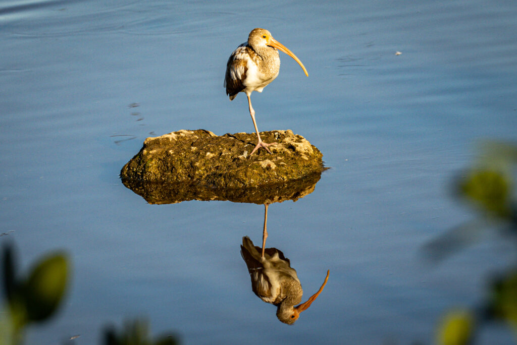
1) Landscape Orientation
BNP: I like the natural framing from the leaves in the foreground and the reflection. I myself would move the subject more to the viewers’ left, not centered in the frame. This way the bird has “looking room” as I call it.
LL: This allows more space to breathe around the bird (I’m a little claustrophobic by nature). I would probably also shift the subject slightly to the left of center (rule of thirds) for a little more dynamic composition.
Mike: It’s interesting that both suggested shifting the image to the left. I’ll give it a try and post again.
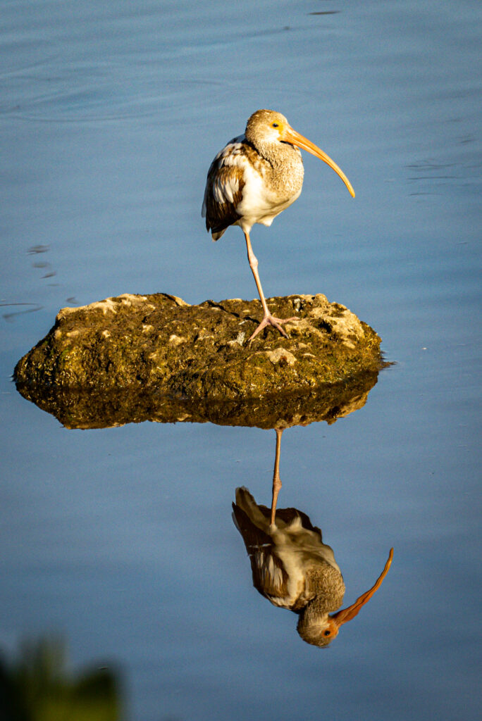
2) Portrait Orientation
KB: [This frame] focuses entirely on the bird without crowding or distractions in the water. In #1 the shortness of the space above its head as compared to the large spaces on the sides is awkward and the Square Frame has distraction in the water that hasn’t been removed and the water lines in the upper left corner detracts from the bird. A main function of composition is controlling the movement of the eye, so #2 keeps the eye on the bird.
MIKE – I don’t like the vegetation in the bottom left corner and the bird still seems even more off-center here due to the narrow frame.
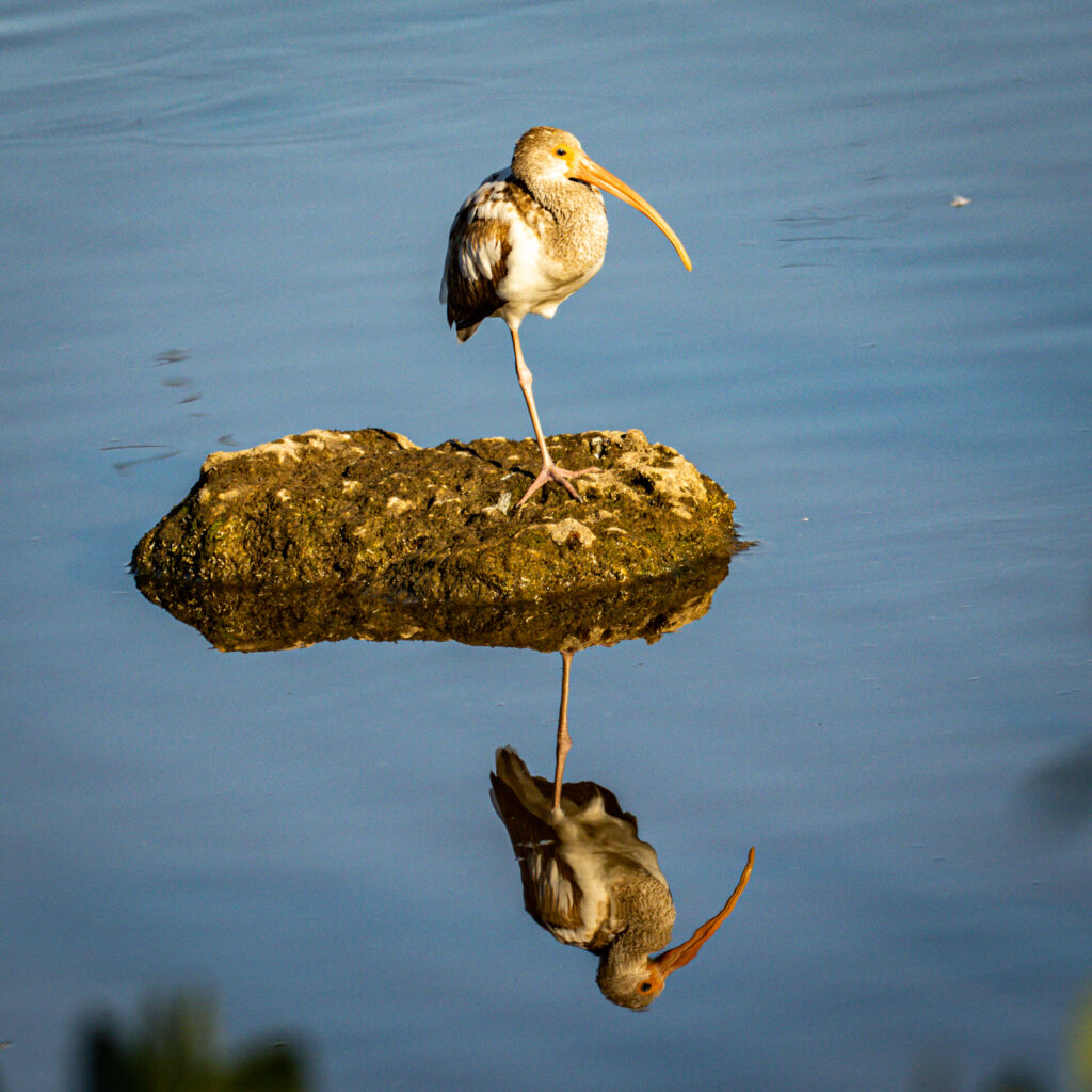
3) Square Frame
Birder2011: I looked at your 3 reflecting pictures. I surprised myself and chose the square reflection. I found it to have less distractions and the ibis got to be the star of the show.
JDB: I like the square orientation. The Landscape orientation brings in the blurry leaves that I find distracting. The vertical [Portrait] orientation is better, but seems too narrow with the crop so close to the edge of the mound. The Square orientation has the best balance for my eye. By the way, we have the same dilemma when photographing trains from overpasses. Sometimes I start off with a couple of shots using a landscape orientation and switch to a portrait orientation as the train gets closer to me. Some of my customers refuse to buy anything with a portrait orientation, but I think there are instances where it is the best orientation.
CG: To my eye, the landscape image looks over-rotated counterclockwise a little bit. Not sure why. Maybe my brain wants the bird’s leg to be perfectly vertical. And I don’t like the portrait orientation – the photo looks cramped. The rock and water need a little bit of context.. I think the way the rock surrounded by water is pleasing in the Square Frame.
Mike: In our informal poll 60% chose the Square frame and 20% chose the Landscape and Portrait frames. I found JDB’s comparison to train pictures interesting as he finds some of his customers “refuse” to buy Portrait-oriented photos. I must say I concur with his customers in most instances; I don’t care for the Portrait orientation for photos that have a long vertical object. My brain just doesn’t see the image well when it is tall and narrow. As others said above, the Landscape orientation leaves a lot of empty space to the right and left of the Ibis in this image. Unless there is something (like foliage) filling that space the bird can look lost in the middle of the frame. In the end, I prefer the Square orientation for this image. It allows the viewer to see the bird clearly with fewer distractions.
Is there a “right answer”? Probably not but this exercise did get us looking at some of the important compositional aspects of our images. Where are the viewers’ eyes drawn? Is the bird prominent or lost in the frame? Does the bird feel too constricted ?
Thanks to all of you who took the time to share your opinions with us. I’ll try to find an image with a long horizontal object (I’d use an alligator, but it’s not a bird) and see if our preferences change.
PS – One side-note regarding viewer “preferences.” Those preferences may be based on what we are most used to. Back in the day (think Brownie Camera) prints were square (remember the black and white prints’ scalloped edges?). So older viewers may “prefer” the Square Frame. As 35mm film came into widespread use most prints were done in Landscape mode. Anyone with a 35mm camera or DLSR may “prefer” the Landscape Orientation. Today cell phones rule the day (about 2 Billion pics per day) and their images are typically taken using Portrait orientation, so younger people are much more comfortable viewing photos that way. So remember your audience when cropping your pictures, too.
if you enjoy seeing beautiful pictures of birds from around the world and reading about them Click Here to sign up for our mailing list. Members can post their GreatBirdPics and learn more about bird photography techniques.


