My brother Xwinger asked why I didn’t upload all my best pictures of the Blue-winged Warbler I analyzed. One reason is time – it takes a couple of minutes to do each one and if you have lots of good pics that takes up a chunk of time. Another reason is I don’t think people want to see a lot of pictures, no matter how good, of the same bird.
I uploaded the next three pictures into GBP:
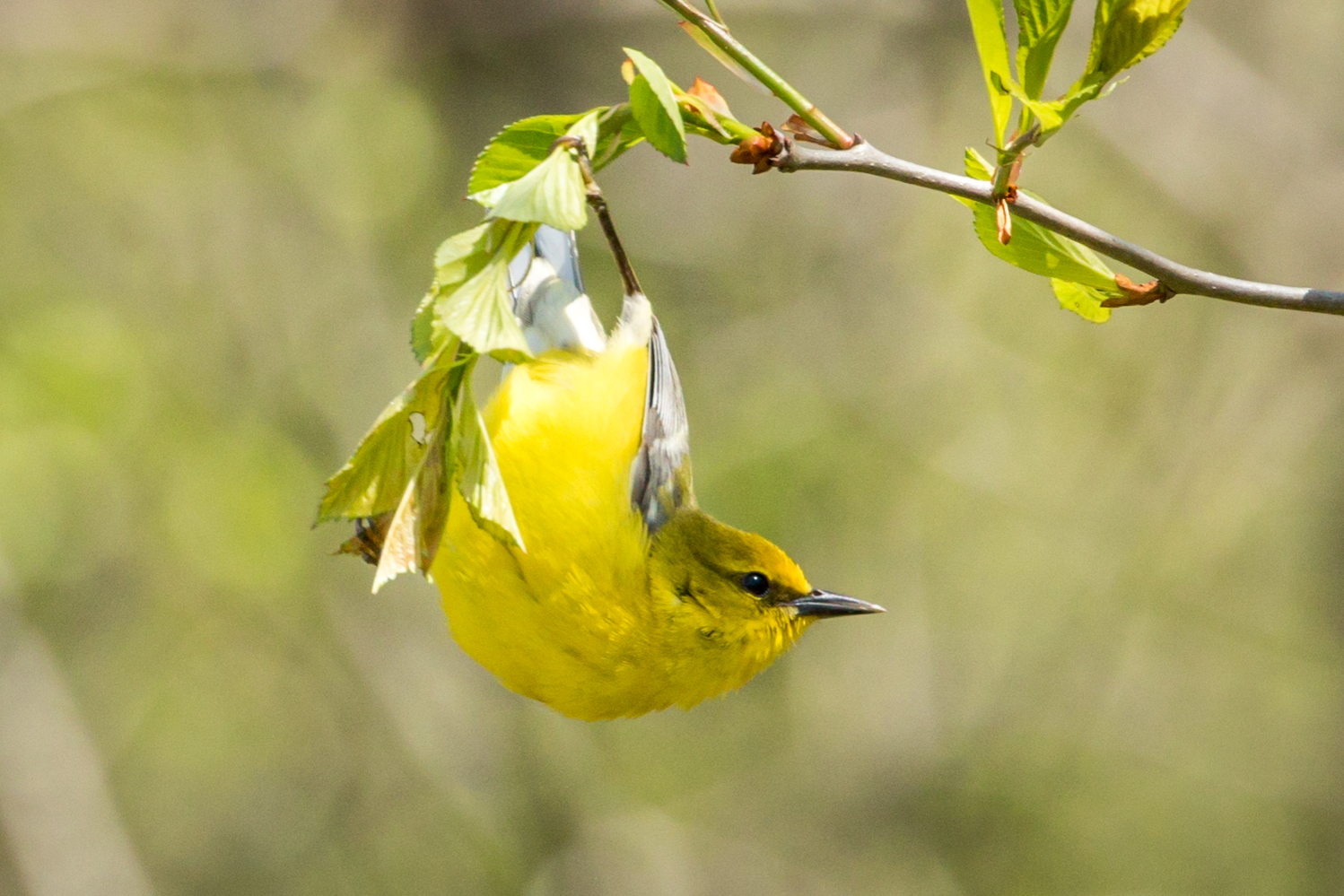
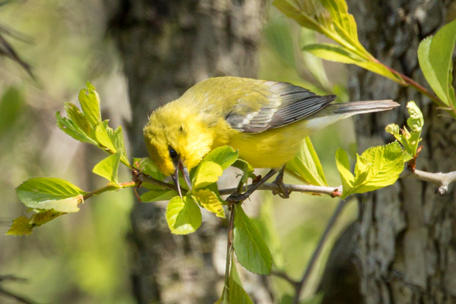
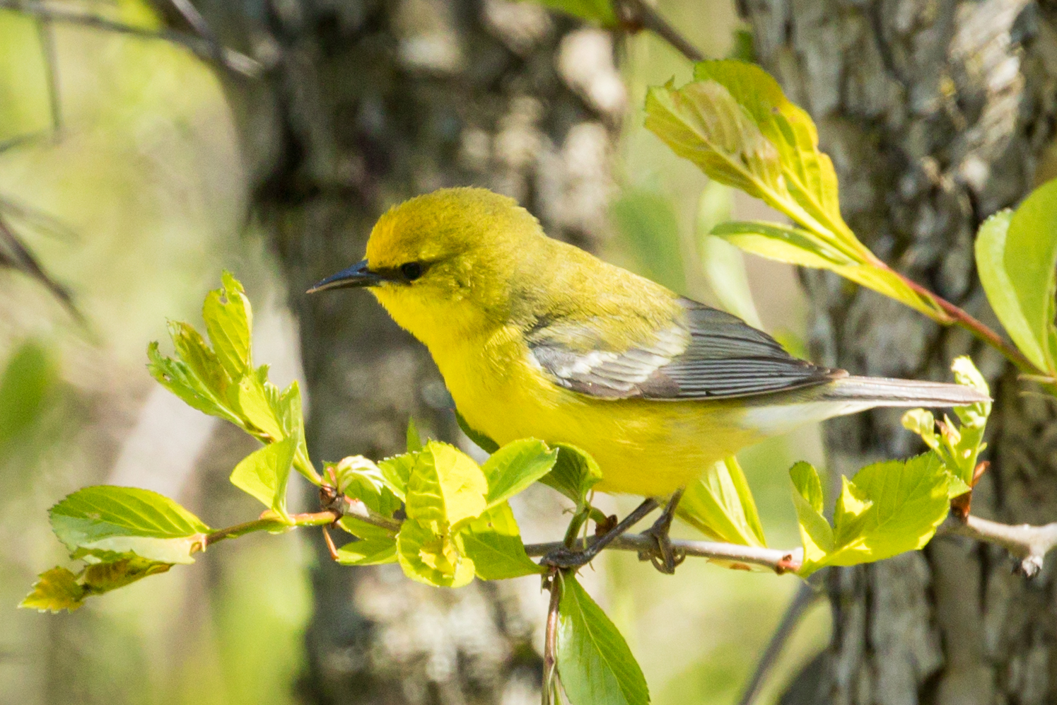
Here are the other 7 of the best pictures (I rate them with stars and I rated all these five-stars) I took of the Blue-winged Warbler that I didn’t put into GBP. Which ones would you have picked instead of the three I posted?
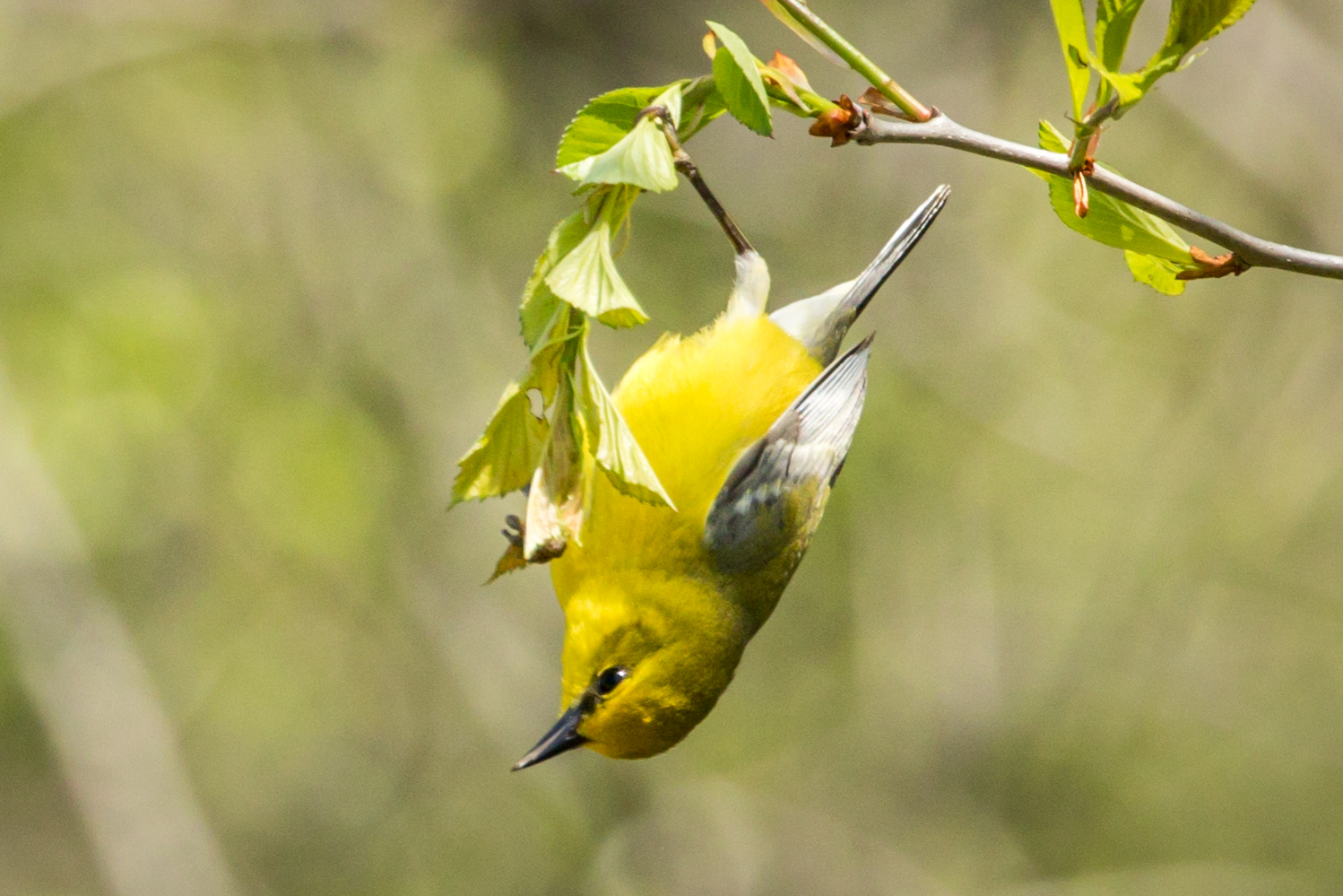
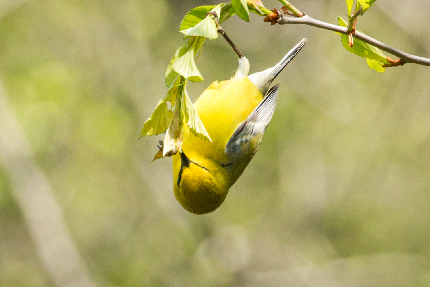
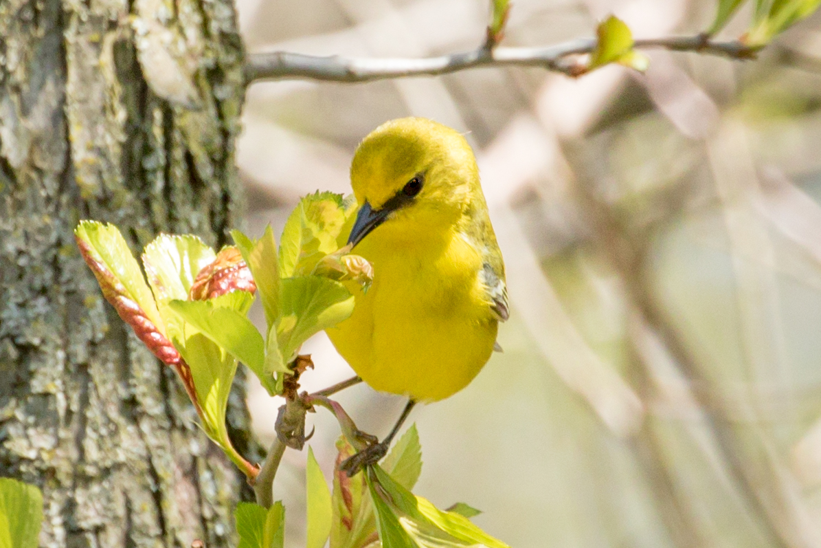
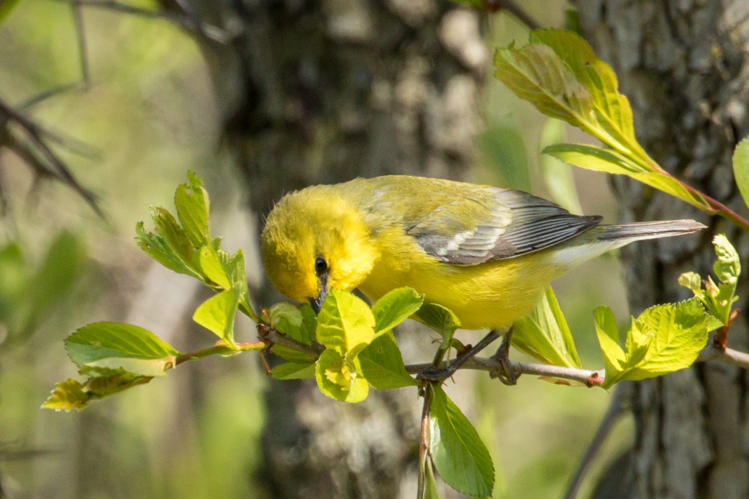
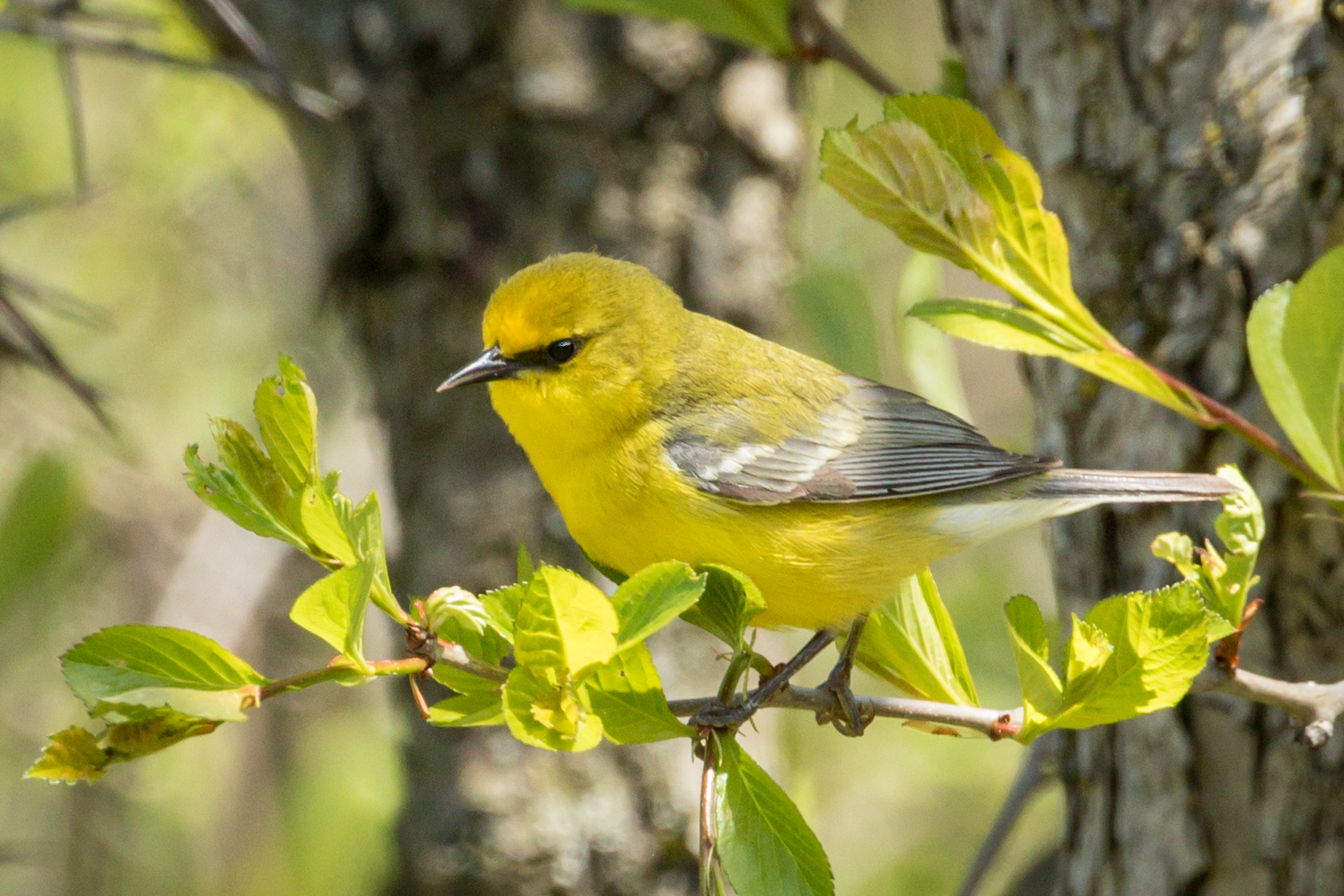
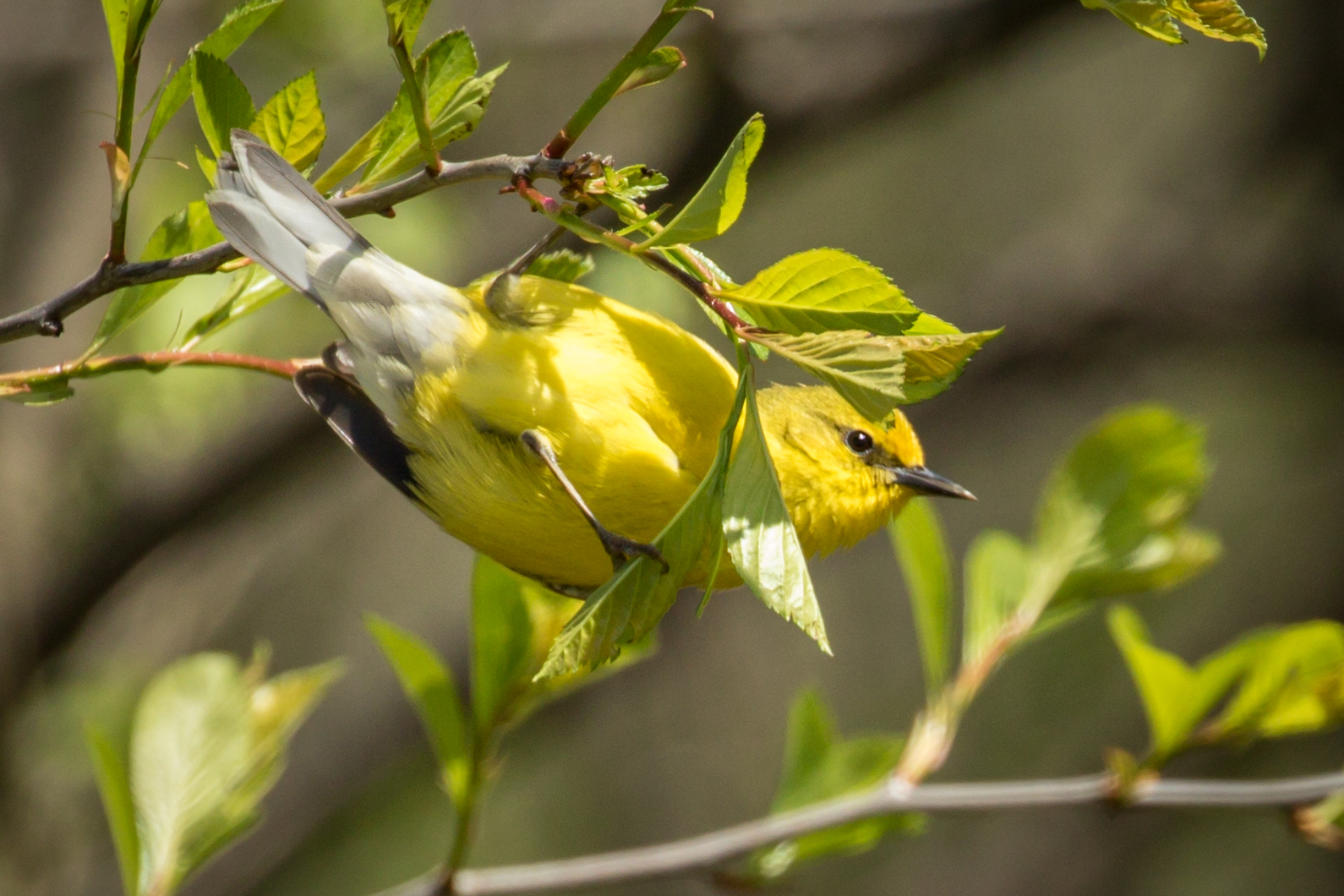
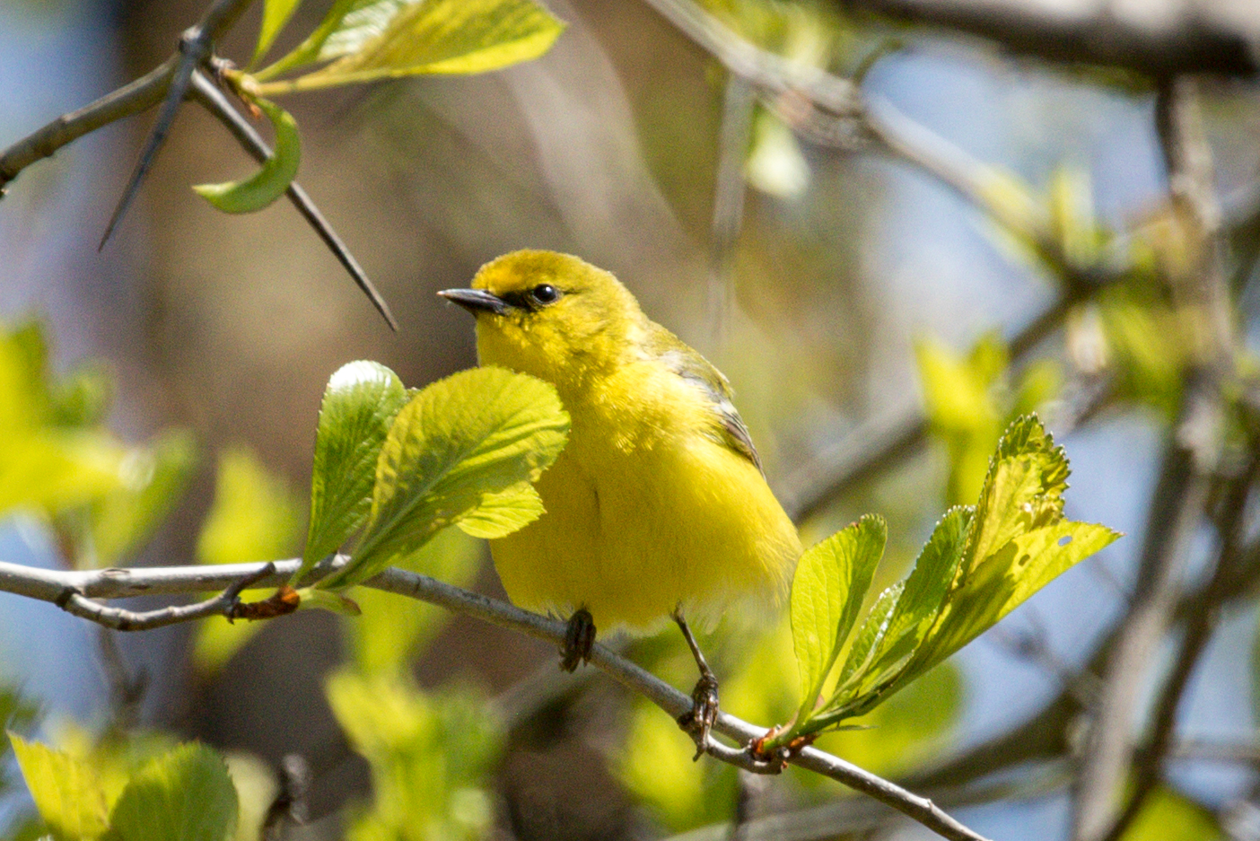
Of the 8, I like #3 and #6. Of the 2, #1 is too green yellow for my taste, and I don’t prefer upside down birds. #2 – can’t see his legs, and his rump is in shadow.
But then again I’m only looking at these photos on my cell phone.
#1 in the first set is perfect. I really like #5 in the second set. It is similar to #3 in the first set, but it seems a little more in focus to me, and you can see a nice highlight in the bird’s eye. I also like #6 in the second set – I like birds in unusual poses that you don’t see in photos everyday, so although I like the second one in the first set I might have replaced it with #6.
You could have replaced #2 in the first set with #3 in the second. I like the additional vegetation in #3.
These are great1 Love the various poses!